Taking inspiration from our surroundings
Recently we’ve been looking for some fresh inspiration for the online learning experiences we create for our clients. And what better way than a stroll in the fresh air! Armed with open minds and mobile phones, we took to the streets of Halifax to see what we could find…
First of all, we hit the Piece Hall (we’re based in an old mill building opposite one of the entrances). On the top floor, there’s a couple of specific rooms set aside to learn about the place and its history, and there are some real gems…
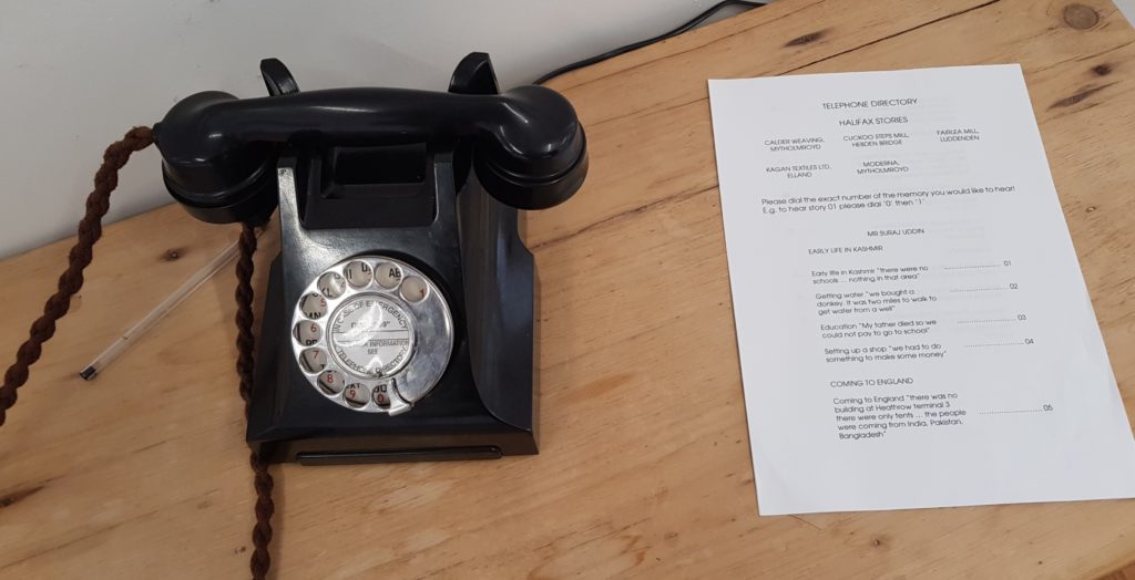
As we walked into the first room, an old rotary phone on a small sideboard started to ring – a little odd. We looked around to see if there was any expecting a call, and when we realised it was just us we picked it up. We then quickly realised it was a way to listen to stories from those connected with the Piece Hall. Cool!
This got us thinking about:
- How we can use the element of surprise, or the weird and whacky, to grab attention. It needs to have substance behind it, but how can you capture your learner’s attention when they first walk into the ‘room’?
- The power of physical items. We’ve previously talked about the importance of ‘thud value’.
- The adage that the ‘Medium is the message‘. It would have been quite easy just to have the stories written on the wall – by having them delivered over an old phone it feels more human and real.
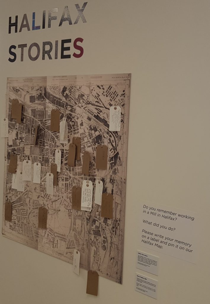
Further down the room, there’s a map of the Halifax, and an invitation to write your own memories on a label and pin it to the location.
This got us thinking about:
- The importance of learning from others. Shared, social experiences can provide a richness and insight that simply the ‘authoritative’ view. We’re currently exploring providing learners with the opportunity to share their experiences as part of online courses.
- Interactivity, and how, together, learners can create digital content. If you’re creating an online learning experience, think about how you could use Padlet or Trello to do similar things.
In the next room, there’s a wonderful interactive touch screen display. You can see different maps from previous centuries, zoom in and out and click on hotspots to learn about specific topics. This is nothing new – we often use similar tools when creating online courses. But it did remind us to:
- Put the learner at the centre of the experience. Let them take control and explore.
- Let the learner choose how deep they go. They know what interests them – let them go to the depth they wish to.
Looking further afield, we stumbled across this map. Naturally, it’s good to give your learners their ‘map’ so they can understand where they are at, and the options they have. But we particularly liked this, as it has a clear understanding of those that would find it most useful e.g. the infrequent visitor or tourist. It highlights the key places they would be interested in, rather than having everything on there and make it difficult to understand for all.
Dotted around Halifax are marker points, outlining a trail related to areas of religious importance. These are perfect guideposts for those that want to meander but have some structure through it. This got us thinking about:
- Using ‘breadcrumbs’ to guide users through an online learning experience. These can help people navigate through, and revisit pertinent pieces.
- It gives some direction but is not overly prescriptive. The learner is very much in control but has a guide to use, should they want to make sure they’re going the right way.
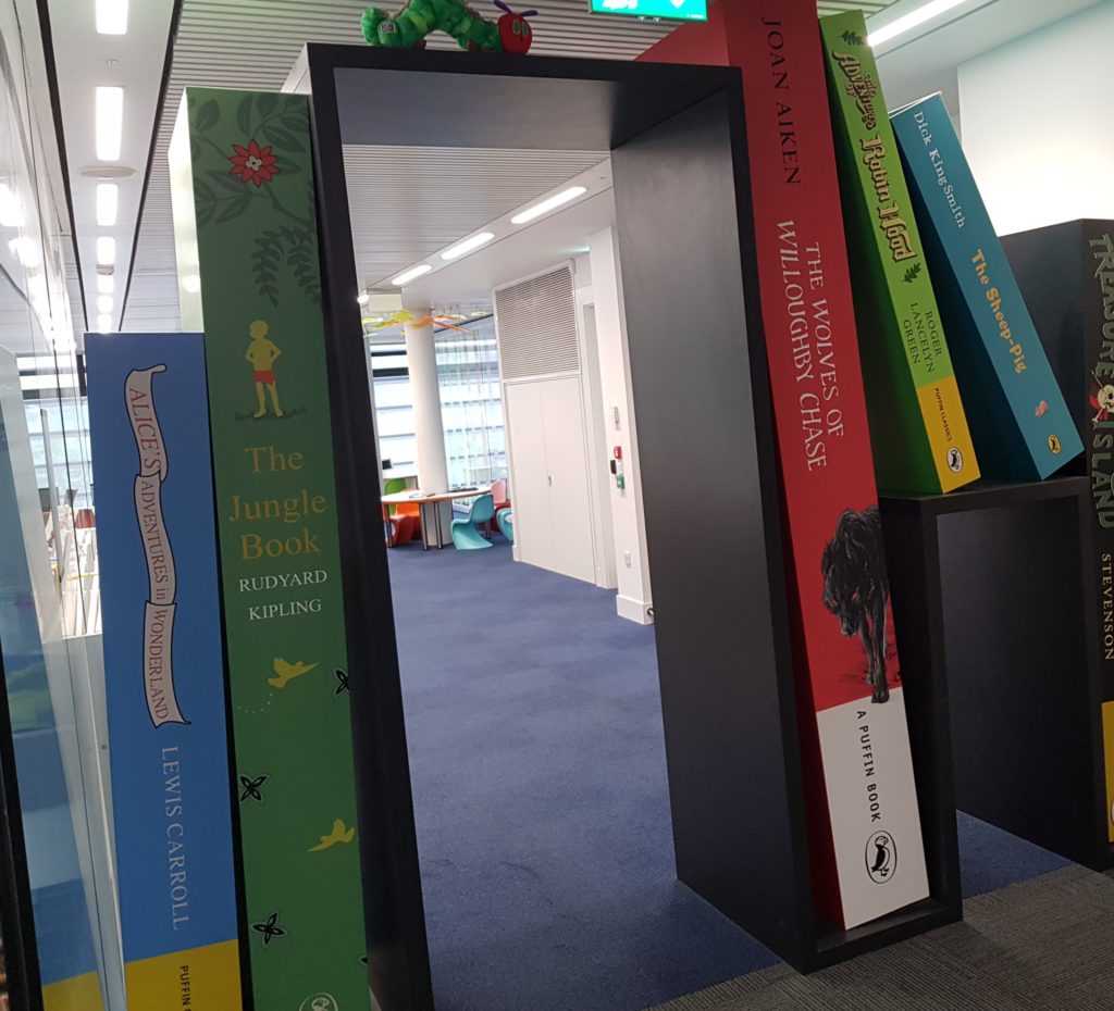
Popping into the new Halifax library, there’s a section obviously marked for kids. This large visual display clearly signals what the space is for and who it’s aimed at. Thinking about this from an online learning perspective, it reminded us to think about how we design online learning platforms and making sure the different areas (for example, where the resources are) are clearly signposted. Good design should instruct and it reminded us of the importance of this.

Heading back to the office, we realised we’d forgotten our keys, and needed help to get back in! We spotted the sign, and thought, isn’t it important to give learners a quick and easy way to ask for help, especially if they can’t access the platform!
![]()
Finally, back in the office and looking at the window at Beacon Hill, we thought about the concept of a beacon. It’s a central point of reference,- wherever you are – and helps you understand your location. In the same sense, when thinking about online learning platforms, make sure there’s always a central place a learner can go to ‘get their bearings’. This could be as simple as the homepage, or a ‘my account’ page where they can understand their progress.
If you’re designing your own online learning experiences, we hope this gives you some fresh ideas. If you need any more, why not take a wander yourself and see what inspiration you can find?
Fresh insights direct to your inbox
Join the Candle Digital mailing list

